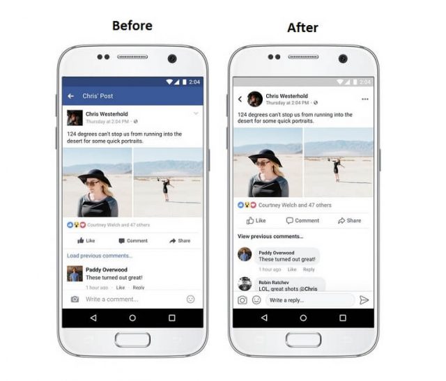
Facebook has come up with new revisions in its mobile app from time and again. This time it has played with design elements, going with line drawings to make the News Feed more clickable and legible.
With the aim to neutralize complexity and navigation controls due to varied stories in users’ News Feed, Facebook has made certain changes involving Comments section, Navigation options, Typography, Icons and other design ethics.
This is what Facebook’s design team said, “Every person’s News Feed is different and populated with a unique set of stories — from photos and videos to GIFs and links. And with so many types of stories available, each feed is more complex than ever. In order to make News Feed more conversational and easier to read and navigate, we’ll be making a few updates to its design over the coming weeks.”
Facebook has gone the bubble way for its comments section where comments are threaded in a greyed-out box with rounded corners, typically like a chat bubble. The section is alive than ever, which makes easier to distinguish replies from different users.
News Feed has been treated with new font and icon styles. The size of icons for Like, Comment and Share buttons has increased while they are now hollow similar to Instagram’s buttons. The increased size makes it easier for users to tap.
Facebook has worked on its color contrast and white spaces to reduce eye fatigue during long browsing sessions. Now, you get more white space with content popping out vividly than earlier.
Shared links preview has also been addressed. The preview is larger, easily readable with website link being placed above the title of the article instead of beneath it.
Additionally, squares have been ditched for circles. User profile picture is now circular. Plus, the navigation buttons impart circular, casual and fresh feel. Notification icon now has a standard bell look instead of the globally-accepted notification icon.
You can now be aware of where a post link in your News Feed is redirecting and on whose post, you are commenting. Plus, there is a prominent back button to take you back to News Feed once you are done.
The company has already rolled out the changes for its mobile counterpart, iOS and Android while the same awaits to embrace the web version, however, we’ll soon see that too.
Live broadcast now lets users add creative doodles and filters during their live session. Plus, you are now leveraged to share posts from the popular Facebook Stories.
The design revamp isn’t limited to Facebook but its sibling, Instagram. Threaded comments have been introduced to improve the direct communication between users. It is more clear, clean and sleek.


